ShopDreamUp AI ArtDreamUp

Deviation Actions


Description
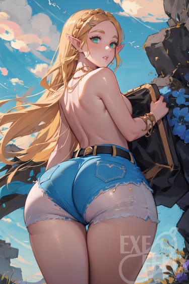
Sharing personal illustration exploring color/lighting
If you are interested in commission, send me a note or email me at jackiewei.wei@gmail.com
:origin()/pre13/e2af/th/pre/f/2017/190/c/0/larissa_mageborn_by_jackiefelixart-dbfnfwx.jpg)
:origin()/pre04/d2a1/th/pre/f/2017/182/2/0/muriel__commission__by_jackiefelixart-dbefe2w.jpg)
:origin()/pre11/b3a2/th/pre/f/2017/163/3/e/female_swordsman_avatar_by_jackiefelixart-dbchwq0.jpg)
:origin()/pre03/a713/th/pre/f/2017/158/2/7/female_halberdier__commission__by_jackiefelixart-dbbwm72.jpg)
:origin()/pre01/e9ad/th/pre/f/2017/151/7/d/female_sorceress_by_jackiefelixart-dbb1nxa.jpg)
:origin()/pre15/1255/th/pre/f/2017/107/b/5/halls_of_power__commission__by_jackiefelixart-db3v81c.jpg)
If you are interested in commission, send me a note or email me at jackiewei.wei@gmail.com
Image size
600x830px 469.7 KB
© 2017 - 2024 ExeFelixArt
Comments10
Join the community to add your comment. Already a deviant? Log In
I just wanna say I looked through your gallery and I really like your stuff. It has a really cool fantasy art aesthetic, and I always like that. You've got a lot of cool ideas, and your composition is very nice.
A couple of things I would watch out for, though: The color of the reflected light in this piece doesn't seem to match the environment in some places, such as the underside of the dragon. If it had some of the greenish-yellow from the light hitting the log in that shadow, it would show the proximity of the dragon to that area of the environment better. That's also true for some of the shadows on the elf, such as the red area under her legs and on her foot, but that patch of light in particular really stood out to me.
I think you've got a decent sense of anatomy, but going through some anatomy references and doing some figure studies could help a lot. The muscles in your figures feel a little generalized, and sometimes the proportions are a little off. The lower legs in this one, for example, feel a little long. Your faces are very nice, though.
The one other thing I would say is don't feel the need to overwork certain areas of a painting. I really like her face, and I really like the dragon's face, but they don't feel to me as if they fit together in the same painting. They feel different stylistically, and if I had to choose one to change, it would be to allow her face to not be as smooth and in focus, because for that to fit, more of the painting would need to reflect that level of focus, and honestly, I really like the style of the rest of it. It looks cool without needing to look entirely photographic.
Anyway, really cool stuff! I look forward to seeing more. Honestly, I feel a little embarrassed critiquing this, because I'm pretty sure you're way better than I am.